Chart and result interpretation
To represent the data, we will use in the toolbar:
charts
chart types
XY dispersion
dispersion 1 subtype
Range1!$B$4:$C$33
Go back to the toolbox and in charts
Aggregate regression line
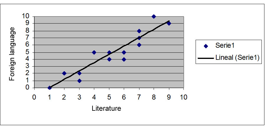
Chart and result interpretation
To represent the data, we will use in the toolbar:
charts
chart types
XY dispersion
dispersion 1 subtype
Range1!$B$4:$C$33
Go back to the toolbox and in charts
Aggregate regression line